How to Create an Aesthetic Instagram Feed
Whether you only have your personal Instagram or you’re in charge of managing upwards of 10 accounts (that’s me lol), you are likely concerned about your feed. After all, Instagram is a photo-sharing platform turned marketing tool turned influencer hub. While you might only be sharing photos to 50 of your closest friends, having an aesthetic feed can be super fun. However, if you are running a business or trying to appeal to a large group of people, an aesthetic feed is a must. Here are my tips on how to create an aesthetic Instagram feed that represents your brand.
First, what is your brand?
If you don’t know what you want your brand to be, it will be hard to create a feed that represents it. I plan on doing more posts about developing your personal brand, but there are a few easy questions to ask yourself:
What am I selling, myself or my business? If you answer yourself, it’s time to discern who you want your followers to think you are. If you are representing a business, think about what you are selling, your usual customers and what you want your business to look like.
Here’s a good example of how the aesthetic differs between a personal brand and a business.
Kalyn Nicholson is a Youtuber who makes lifestyle, travel and spiritual content. She is also a published author. This is her personal brand Instagram:

Kalyn also runs a business called Koze. This business sells cozy clothing, supplies, books and more. This is her business Instagram:

You can see from this example that Kaylyn follows a different aesthetic for her feeds. Her business account is more focused on the product she is selling and the feeling that she wants her customers to have. Her personal Instagram is more true to her personality and video content.
Pick a colour scheme and stick to it!
Likely, if you are a business, you have a colour scheme, even if it is just in your logo. A cohesive and aesthetic feed looks best when you stick to the same colours over time. You can choose a few colours or just one. Then, when you create content, stick to this scheme.
Here’s an example of what I mean by choosing a colour or two and sticking to it. This Instagram feed belongs to a social media company and the focus colour is pink. The girls that curate this feed know to stick to this same colour scheme. It would look so weird if there was just a random photo with a dark black background…

Use a filter and keep it the same
Using a preset or a filter on your Instagram photos is a huge step to keep your feed cohesive. If it were up to me, I would NOT use the ones that come with Instagram ( I think they are super ugly ), but you can do that as a start. Personally, I use VSCO and I just throw on the C1 filter on every photo. I don’t even edit the saturation, colour, etc. However, if you want to go hardcore, you can use a preset on Lightroom or make your own filter. Some other apps that people often use for presets and filters are Tezza, Facetune (be careful with this though, don’t over-edit), FLTR and Snapseed.
Most influencers use the same filter on all of their photos because this makes it look wayy more cohesive. Here’s an example:

This is Katy Belotte’s Instagram. You can see here how she has the same filter and tone on all of her photos.
When you scroll down on her page, you can see what it looks like when she changes filters. You can change filters each season, each year or never, it’s completely up to you. Here is what it looks like when she changed:

But how will I know that it looks good??
Plan. Creating content in advance and scheduling it or at least planning it out will be a lifesaver. You can use a planning app like Later or Planoly that you pay for and that will automatically post your scheduled content. However, there’s a much cheaper and easier way to make sure that your feed looks good before you post. Using a grid planning app, such as UNUM, will let you see what your grid looks like before you post your photos.
Creating the perfect grid
When you’re planning out your grid, you want to disperse the same types of photos throughout the grid, not right next to each other. If you have the option of having content that is diverse, you can use this to your advantage. The grid will look cleaner if you don’t have two of the same photo in the same area of the grid. Split up quotes, photos of people, and landscapes.
Here’s an example of a really good grid:
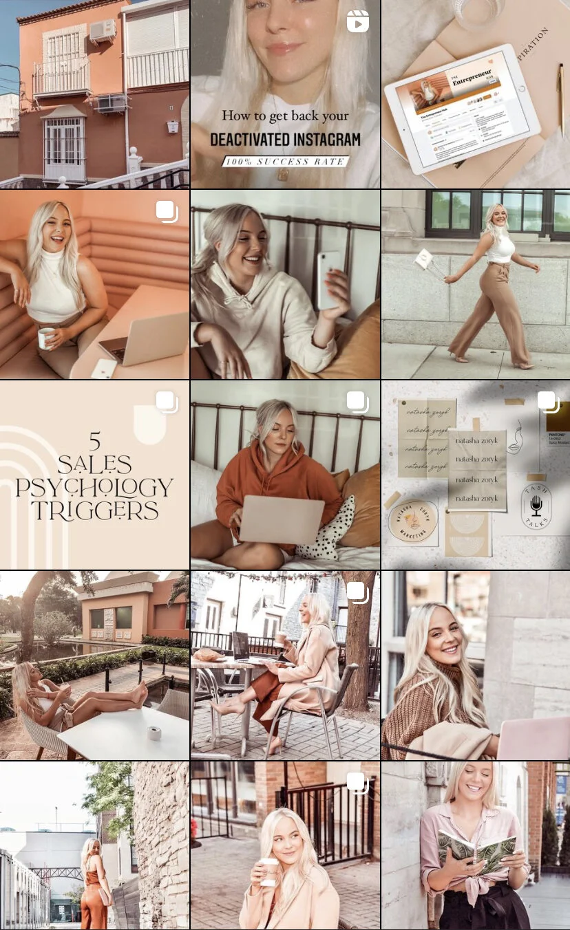
You can see that Natasha has spaced out a lot of her similar content, such as photos of content, photos of herself, and photos of things. Even if she has two photos of herself in one line of the grid, they are shot from different angles.
I love Holtworkspace’s content, but you can see from this photo that their content looks messy. This is for two reasons. First, they sometimes stray from their colour scheme. Second, there’s a lot of text and it isn’t spaced out well. Studies show that people will like photos with people in them more than with text, so use your face to your advantage! Captions are the best way to get your point across while using a photo of yourself.

Some grids that I love:


Hope this helps!
